Tuesday
A good car commercial? No way.
Thursday
I cringe every time I see this.
Anyway, have you ever seen this commercial? You probably have considering I see it every time I watch TV. And every time I do see, it manages to piss me off for whatever reason. It's just stupid. I know, expert analysis, right? But honestly, who wants to watch a kid swinging a bat and getting no results for 20 seconds? Not only is it not very entertaining or appealing to the common consumer, you can switch out any car logo on the front of the pinata and have it be a commercial for that brand of car. I get that it's supposed to be a clever way to show safety or reliability, but what actual features of the car supports that? We don't know because they never show the actual car or any upgraded features that make it safer and more reliable.
Friday
I've never seen a Comcast commercial that I like.
Monday
To get the full effect, I'm not even going to explain this one.
The Ad
It's a little questionable. Especially the set-up. But still, I think it's pretty creative and definitely something that will get people talking. And sharing.
It's a little questionable. Especially the set-up. But still, I think it's pretty creative and definitely something that will get people talking. And sharing.
Wednesday
Rounding out my Sealy campaign.


So this is the outdoor portion of my Sealy campaign. We were assigned to just make an alternative outdoor ad, but I took it a step further with the billboard. I did this because I saw this image and I couldn't pass it up because it worked perfectly for my campaign. As for the alternative "guerrilla" ad, I tweaked the concept a little bit because I had a hard time thinking of something that would symbolize a couple falling asleep rather than making love. Though, if you have any ideas, feel free to post them! As of right now, I'm not completely satisfied with my alternative piece, but my professor loved it. I was also thinking about putting this kind of thing on train station benches and various other public transportation spots, but you get the idea with this image. Comments are welcome!
Tuesday
Apple much?
The white background, the (not-so) friendly comparisons, and even the kind of music in the background. When your main competitor is the Apple iPad, why would you pretty much copy the same advertising as Apple? Yeah, I understand that this was some great advertising that Apple developed, but that should never mean you should base yours off of it unless you're completely satirizing it. Can we see some originality please?
Thursday
Finally, some honest advertising.
Wednesday
Updated Sealy Commercials.


Tuesday
Ugh.

Monday
I'm surprised I haven't posted this yet.


This is the front and back of a postcard I wrote for my Diamond Edge Communications account- The School of Communications and Theater's Study Away Program. We passed these out to interested students during Temple's Spring Fling last week to promote our information session about the program this Wednesday. It says the information session was last week (which was actually the date that Spring Fling got postponed to), but we had to postpone it because of this, and I had to print out 1000 labels and cut and stick them all onto 1000 postcards. It was a much fun as you can imagine. Anyway, the copy was an adventure to write. Originally, I wrote something really generic and boring and presented it to my professor and immediately he dismissed it and told me to write it all over with a more conversational tone. It was a challenge I was willing and able to accept though because I redrafted this and presented it to him an hour and a half later and he was very pleased. Also, during that revision, I decided to take the Temple T logo out of the stamp spot and replace it with a QR code that directs you to the program website. Again, a change that my professor and my account manager both loved. Hope you like.
Thursday
Really good spot.
Recently, as you may have read from my last post, a professor of mine assigned us to write a commercial that is strictly dialogue between two people. I think he had the inspiration for the assignment after he saw this commercial because it is really the most effective dialogue commercial I think you can find right now. Not only does it demonstrate the amazing capabilities of the iPhone, but it does it in a funny and highly humanized way. For the most part, commercials with as much dialogue as this tend to not be as appealing to the common consumer because they sound so much like a gimmicky advertisement. This spot, however, did not. It is simply a very well written, well thought out, and consumer-relatable way to show how powerful of a phone the iPhone can be. (Even though it is technically an AT&T commercial).
Tuesday
Working copy of a new commercial script for Sealy's mattresses.


First off, I realize the people are different in almost every shot, but of course I was not able to find all these shots by the same two models. Anyway, this is a commercial I recently wrote for a project we were just assigned in my Portfolio class. I still have to rewrite it into two separate commercials because I misunderstood the assignment originally. We needed two commercials- one that is all dialogue between two people and one that is all visual. For some reason, I thought he wanted us to do both in one spot. I love the concept though, so I am going to stick with it and the rewrite them into two separate, very similar commercials. In any event, feedback is still much appreciated regarding this spot. I'll be sure to post the rewrites sometime in the next week.
Monday
No respect for anyone who wears Old Navy.
Why would anyone want to be associated with THIS brand image? Especially if you're a straight male. This guy looks like a gay theater performer from New York, not someone that your male audience would like to emulate. I understand, this particular spot is targeted to women, but at the same time that shouldn't detract from your male audience that will likely see this also. Not only that, but I find this entire commercial to be pretty unappealing to the general public. The song is not catchy. Everything is way too childlike. And the lyrics are simply horrible. (i.e. "You're gonna light that ATM line. That glitter make me twitter. You so fine). I mean, honestly? If I was sitting in on the meeting that this was pitched in, it would take all my willpower to hold back from hysterically laughing. Ads like these make me want to break into the business even more. Just so that I can write better ads and stop ones like these from being circulated.
Thursday
Dear Red Tettemer: Hire me?
Last Friday, I went on an ad agency crawl and Red Tettemer was easily the best one of all. Their agency is located on the 24th floor of 1 South Broad, and I can definitely say I've never seen a cooler looking agency and a more beautiful view of Philly. Outside of the appearance though, the people at Red Tettemer do some really wonderful work. During their presentation, they showed some of the best stuff they've done and this is the one I liked the most. I love this spot and the entire campaign. I can't think of a better way to market a men's soap to men than to make it in such a fun, masculine way. Of course, you could always do this through hot girls with huge boobs, but we all know how I feel about the over usage of sex in advertising- it's almost always the least creative way to go about it. This, on the other hand, is brilliant. The filthocratic oath concept is such a fitting way to convey the message and feeling of the ads that it really completes them and makes it into a flawless campaign. Well done. If anyone for Red Tettemer is reading this, my email address is afiore@temple.edu and I am available at any time during the week for an interview. Thanks :)
Tuesday
I'm not entirely happy with it yet, but it's a work in progress.


I think the problem I have right now is the video transition between the Mastiff and the less fortunate dogs in the PAWS shelter. Originally, I wrote a completely different concept in the beginning that I scrapped (and don't even want to mention because it was so dumb) and replaced with this concept of the world's most expensive dog. I really like the beginning concept and I really like the ending, but I'm struggling a little bit with flowing them together I think. Also, this was originally supposed to be a 30-second spot, but I think this might be turn out to be a 60-second spot. Though, this could be cut down a bit by taking some of the voiceover dialogue out in the second half. Anyway, I hope you like it. I will be posting edits later on after I present this to my professor and see what he thinks.
Monday
It's pretty sad if your MLB team needs such a big budget advertising campaign, but I still enjoy this.
I wasn't necessarily blown away by this, but it's pretty well done to say the least. I especially liked the last scene with the catcher pulling away the chair and crouching down to eat instead. They definitely did a good job of translating the cliche of "eating, sleeping, and breathing" something into the mentality of their baseball players. Not only they, but they made it pretty humorous too. My only criticism is that the order of the events should have gone in the order of the phrases (the lunch scene, then sleeping scene, and then the other two). Other than that, I really enjoy this spot and the entire campaign. Maybe the Mets should do something like this so their fans aren't so ashamed (like myself).
Wednesday
Sorry, Ads of the World, but I think this is garbage.

Tuesday
Another TAC agency poster.

Monday
Dear the art director who created this... Be my best friend?

Thursday
Hey, Bing. Everyone is already loyal to Google. So, stop wasting your money on advertising.
On TERRIBLE advertising, that is. Other than the supermarket one, this is the worst commercial I've seen in this whole campaign. I mean, I get the concept: sometimes you can't find what you're looking for right away on a search engine so you're forced to read everything about anything relevant to what you're searching for, and then your mind gets lost in all the somewhat relevant, but also rather unneeded information. And that concept is a decent one. But the execution of these ads is so bad that sometimes you don't understand it at all, and therefore don't want to use Bing. Not only that, but these commercials fail to really show how it is that much better and more useful that its competition (Google). Everyone is already so loyal and used to Google, so an alternative really has to stick out with major beneficial differences. These commercials not only fail to do so, but also have become a bit of an annoyance to see over and over on TV.
Wednesday
My most recent campaign.


So, this is what I have so far for my public service campaign. I chose PAWS because I've always felt like people should never buy a pet when they can adopt or rescue one (much like I did with my cat!). The was the concept I wanted to go for and I pretty much ran with it once I thought of the line I used for the billboard. I'm really happy with how this is coming along so far. I just need to complete it by adding a 30-second commercial, but I should have that done by the end of the week. So check back soon for that posting. I hope you like it.
Tuesday
UGH. More terrible concepts and execution.
Let's be realistic here. So you walk into your house and notice that everything you own has been stolen. Would you honestly be that calm as you walk around and investigate? And then when you come across something that they didn't steal, would your first thought be, "Hmm, maybe it's time for a new one?" Coming from someone whose house was robbed when they were 9 years old, this would NOT be the first thought and the owners would NEVER be this calm. But not only the concept, the execution sounds so commercial and unrealistic that it really makes what they're selling unappealing. And I swear, you almost see the guy smirk when he comes across the computer. Stuff like this just simply cannot be taken seriously.
Thursday
A bit of an easy concept, but still a great one.

Wednesday
Hey, I know HTML now, too.

The School of Communications and Theater offers study away opportunities in London, Dublin, Montreal and Los Angeles, which provide enriched academics as well as valuable work experience. Gain a new perspective on your academic studies, experience a different culture and develop skills to give you an edge in today’s competitive environment.
 Take advantage of Montreal’s unique position as a hub of video game development in North America. Courses available specialize in the video game industry. |  Immerse yourself in a rich culture of musical and literary brilliance, and experience a modern metropolis on the cutting edge of film, design, music, and architecture. |
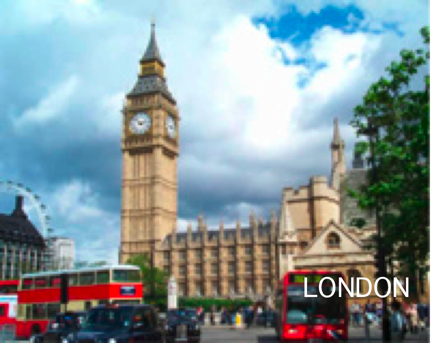 Experience a cultural melting pot and leader of modern styles and trends. Rich in cultural and intellectual life, London is a mecca for students of the mass media and theater departments. Internships are also available. | 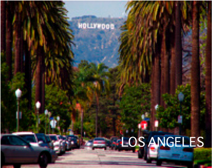 Los Angeles offers students an opportunity to study and work in the heart of the film industry. Internship opportunities span from film, television, advertising, public relations and entertainment management. |
Or to apply, please visit the program website and contact SCT Study Away Director,
Erin Palmer at erinj@temple.edu.
Tuesday
You're really letting me down, Apple.
Anyone who knows me well knows I have somewhat of an Apple bias, but I really can't stand this commercial. The concept itself is a good one because the App store is amazing and the things an iPhone can do are pretty remarkable. However, the execution of the copy is horrible in my opinion. It's almost reached the point that it is condescending and that asyou're seen as lesser for not sending a lot of money on Apple technology. Though, my biggest issue with the commercial is the last line. "Yup, if you don't have an iPhone... well... you don't have an iPhone." Honestly? That's the tagline that they're going to end you with? Well let me be the first one to say it, I TOTALLY want to buy from you after you make me feel inferior for not already doing so. I simply can't believe Apple actually paid someone for that line.
Monday
These are too good.
I think the one in the hospital is my favorite. I recently found this on StumbleUpon and, needless to say, I was throughly impressive. They're just too funny. And the concept is flawless. It is a common perception that it is difficult to be approve for a loan by a mortgage broker unless you have excellent credit history, so to position themselves as an tolerant, understanding brand is a strategy that will really attract customers. And to display this in a clever, funny way that is memorable to people in their advertising makes it even better. Very, very well done.
Thursday
Other than AXE and Abercrombie, there are few things worse than American Apparel ads.

Wednesday
This is a rough draft, but I'm liking the concept.


However, I do think it needs to be somehow improved a bit. What I was going for was having the driver in the car ignore all signs of updated technologies because he's too interested in all the incredible new features of the car. I am still working on it and the entire campaign, but your feedback would be much appreciated!
Tuesday
Mind blowing.

Thursday
Possibly the best beverage concept I've ever seen.
After all, nothing is worse in the morning than hearing bad news. Especially bad news about the rest of the day. So, to display the product as a sort of a morning stress reliever and refresher is a very strong concept in my opinion. Also, I love sarcasm and the sarcastic undertones throughout make it pretty darn funny. Though, with that said, although I think these commercials are great, I also think they can be improved a bit. For one, the brand itself is a bit forgotten in the end. People remember the commercial as "that orange juice commercial," not that "Florida orange juice commercial." If it was for Tropicana, this may be a bit of a different story, but "Florida Orange Juice" isn't really remember as a brand product as much as it is a common beverage. I realize there's not much getting around this, but it's just how I see it. Maybe they should consider rebranding with a new name.
Wednesday
Are we endorsing stalkers here?
I'm sorry, I just don't really think its ethical to recommend a phone based on its ability to stalk the personal life of someone you're menacingly obsessed with. Sure, we all might be guilty of our fair share of Facebook creeping, but should we be boasting about it? Or, better yet, selling a product based on the ability to do so? I see what they're going for, but I would kinda feel like a stalker after buying this. I mean, the features are all cool and it comes at a great price, but this commercial almost displays the benefits of the product in a pretty negative light. Unless, of course, stalking is in now.
Tuesday
I can write websites, too.


This is a big element of my final project in Interactive Media in Advertising. We were asked to pick a local business in Philadelphia and remake their website in an effort to make them more interactive and customer-friendly. So, here are two homepages for our client, Mugshots Coffeehouse, and the interactive element we established called, the "Mugshot of the Week." This was the main selling point of our website proposal because it allowed customers a fun opportunity to feel one with the brand. Basically, how it would work is a customer could upload a picture of their "mugshot" to the website, and then fellow customers would vote on which mugshot was the mugshot of the week. The winner would win a free cup of coffee as well as their own mug with their mugshot printed on it. And like everything else on the web today, links to Facebook and Twitter were added to allow these funny pictures to be shared through those websites. Personally, I like the second mock up better than the first, but I'd like to know what you think also.
Thursday
Wow, a beer ad that I actually like.
Product placement is, in my opinion, the most subtle, yet most alienating form of advertising that there is. And a lot of other people are with me on that one. So what better way to advertise for your product than to satirize this bad form of advertising in an effort to show how appealing your product is? That is exactly what is going on here. The more product placement they have, the more free Bud Light they get, so they start to base the movie around the product placement of the beer. I wish I could say that this isn't ever the case in real life, but we've seen it in the case of Macgruber (Pepsi) and the new animated movie, Gnomeo and Juliet (Travelocity). It's a terribly pathetic form of advertising when movies like these are made, but I'm glad someone has taken notice and parodied it in their own advertising.
Wednesday
I'm surprised that the Bengals DON'T want to trade him after this.

Tuesday
More Buick ads.


These are two more ads that I'm currently doing for my Buick project to rebrand them as a young, hip vehicle. The first one is an animated Internet banner ad and the second one is a billboard. And like I've said before, I know how to use Photoshop, but I'm no art director. But I tried. Again, I like the ideation and copy of these ads, but polished art direction can really make them a lot better. So, please. Get at me, artists/graphic designers. I could use your help as well as your opinion.
Monday
Damn it, Kia.
When I was watching the dunk contest, I was like, "Oh, nice shameless product placement there, Kia." But I never thought they would stoop so low to make a terrible commercial that doesn't show the benefits of the product out of it. Well, I guess I underestimated the lack of creativity that they have as a brand. I MEAN, C'MON. Who is really going to want to buy a Kia after seeing the same clip that they've already seen 20 times on ESPN of Blake Griffin dunking over one? If you're not going to sell the benefits of the product, you should at least sell a lifestyle associated with the product. This commercial does neither of those things. Oh, and the copy is also super creative and original... I really hope the writer got paid millions for that.
Here's another Kia commercial that I hate.
Here's another Kia commercial that I hate.
Friday
Best commercial parody ever.
I realize that this is not really an ad and more like a viral video, but it is the best satirization of a commercial that I have ever seen. I thought the Michael Jordan response commercial was the already good enough, but this was amazing. Not only does it have hilarious Brett Favre references, but the contrast in dialogue and direction that is has with the Lebron RISE commercial is incredible. If you watch them one after another, you'll understand how amazing this really is. Also, the addition of the Wrangler references to make it look like another Brett Favre sponsored commercial makes the video even more hilarious. Mostly though, I think I especially like this because I hate Brett Favre as much as I hate Lebron.
Thursday
Have I mentioned that I need an art director?


I know, they look horrendous. But they're still in the process of being revised and remade. Also, they've yet to be art directed by anyone other than my non-artistic self. Still, I like the direction that ideation and copy is headed. Originally, this was an assignment to rebrand Buick as a vehicle that appeals to a more young and hip audience. At first, I found this to be pretty difficult. But after doing some research, I found this concept car in the making and right away I had my concept. I'm still trying to tweak the headlines and tagline, but this was pretty much the concept I was going for: to show how a classic has developed into a complete innovation of the common coupe. Anyway, I hope you like it. Comments and constructive criticism would be MUCH appreciated.
Wednesday
Sure, I would love to risk a coma or DEATH by taking this.
I don't mean to be ignorant or insensitive to people with bipolar depression here, but would you honestly want to try this drug after seeing this commercial? Think of it this way- the commercial is 1 minute and 31 seconds long, the risks or side effects begin to be read off at the :21 second mark, and they end at the 1:19 second mark. After figuring out some quick mathematics, that is 58 seconds of listing risks of taking this drug and 64% of the entire commercial! At this point it is hardly even an advertisement for the product as it is a warning to the general public about this product. Also, outside of that fact, the copy of the commercial barely even describes the benefit of taking the drug. All we know after seeing this it that it "may" help you deal with your bipolar depression. Yet, considering how they're accounted for more in the commercial than the benefits, the risks "may" also become more of a reality when you take this. Oh yeah, and those risks include coma or death. But you depressed people should definitely try it... C'MON.
Here's another commercial like this that I hated.
Here's another commercial like this that I hated.
Tuesday
An example of how celebrity endorsements can take away from an ad.
When I saw the Justin Bieber/Ozzy Osbourne Super Bowl commercial, I completely forgot that it was for this Best Buy Buy Back program because I mostly just remembered it as a commercial with these two celebrities spouting off cheesy lines. This was the case until I saw this commercial last night and later searched for "best buy buy back" on YouTube. In my opinion, this is the better commercial anyway. With this one, the message is clear and it's presented in a entertaining way that transcends well with every somewhat wealthy person in America. On the other hand, I feel like the message is less clear and a little lost behind celebrity awe in the Super Bowl because it fails to emphasis the nuisance of technological products constantly being new as much. Sure, it mentions is once or twice, but it gets lost behind the unrelated humor and appeal from the celebrities. Whereas, conversely, this commercial's humor all stems from the benefit of the service.
Monday
If possible, I'd like your opinion on this.


For the most part, I hate the copy in these ads. But I do like the direction I was headed in with this first ad. I thought it would be a really good strategy to tie the fact that we're Temple "Owls" in with our parents being empty nesters now and targeting it to them. However, I think the execution left a lot to be desired here. I don't know if it needs body copy, better headlines, or a completely different strategy altogether, but it needs something. If anyone may be reading this, give me some suggestions, please! For now, I think I'm back to the drawing board.
Thursday
Way to steal the worst concept ever made.

Wednesday
Who said you can't find morality in advertising?
A lot of alcohol brands try to fit in their reminder to drink responsibly, but most of the time it seems really forced. Often times brands will try to squeeze in a little tagline or an announcer voice at the end that says "drink responsibly" (like here, here, and here.). Though, Captain Morgan is one of these few brands that has tied it into their advertising so effectively that it is sometimes the basis of their ad as a whole. Now, there are also plenty of brands that have also tried this and were ineffective in doing so because they didn't tie the message back to the product very well, and as a result posed more as a sponsored public service announcement. Some examples of this can be found here, here, and here. Captain Morgan, however, hit the nail on the head with their "drink responsibly" ads. This one in particular is such a perfect balance between presenting the product in an engaging way, and persuasively advising you to enjoy it responsibly.
Tuesday
I usually hate all car ads, so I tried to write one.

Monday
Delightfully horrible.
You have to admit, this song is super catchy and is also pretty well written. But with that said, I still don't think it is very good advertising. I only feel this way because it positions the brand to look so childish and cheap that I don't think I would ever trust it. When you're advertising for something like higher education, you should probably make it more about the quality and positive impact of higher education, and how it can change your life. Not, on the other hand, by making it super fun and easy because then it just sounds like you'll be getting crappy education that won't make you very much money. Sure, it might actually be a great service that offers some great opportunities, but this commercial did not make me want to look into it.
Thursday
Correction: THIS was my favorite commercial of the Super Bowl.
Wednesday
Just finished this 20 minutes ago.

Subscribe to:
Posts (Atom)